Case 03 · UX Writing · AI search · Microcopy
Why do people give up on registering a domain?
A domain is usually the first purchase for anyone taking a business online, and the gateway to every other product. Many people dropped off along the way: because of the renewal price, because they had no name in mind or because of an error with no way out. I rewrote the page, created the content for the new AI-guided search and redesigned the error messages.
The challenge
Three things were holding the decision back:
- A price that changes. The first-year price differs from the renewal price, a classic source of distrust.
- A blank page. Many people arrive without knowing what name to choose.
- Errors with no way out. When the searched domain has a problem, the message needs to offer the next step, not just report the failure.
The page
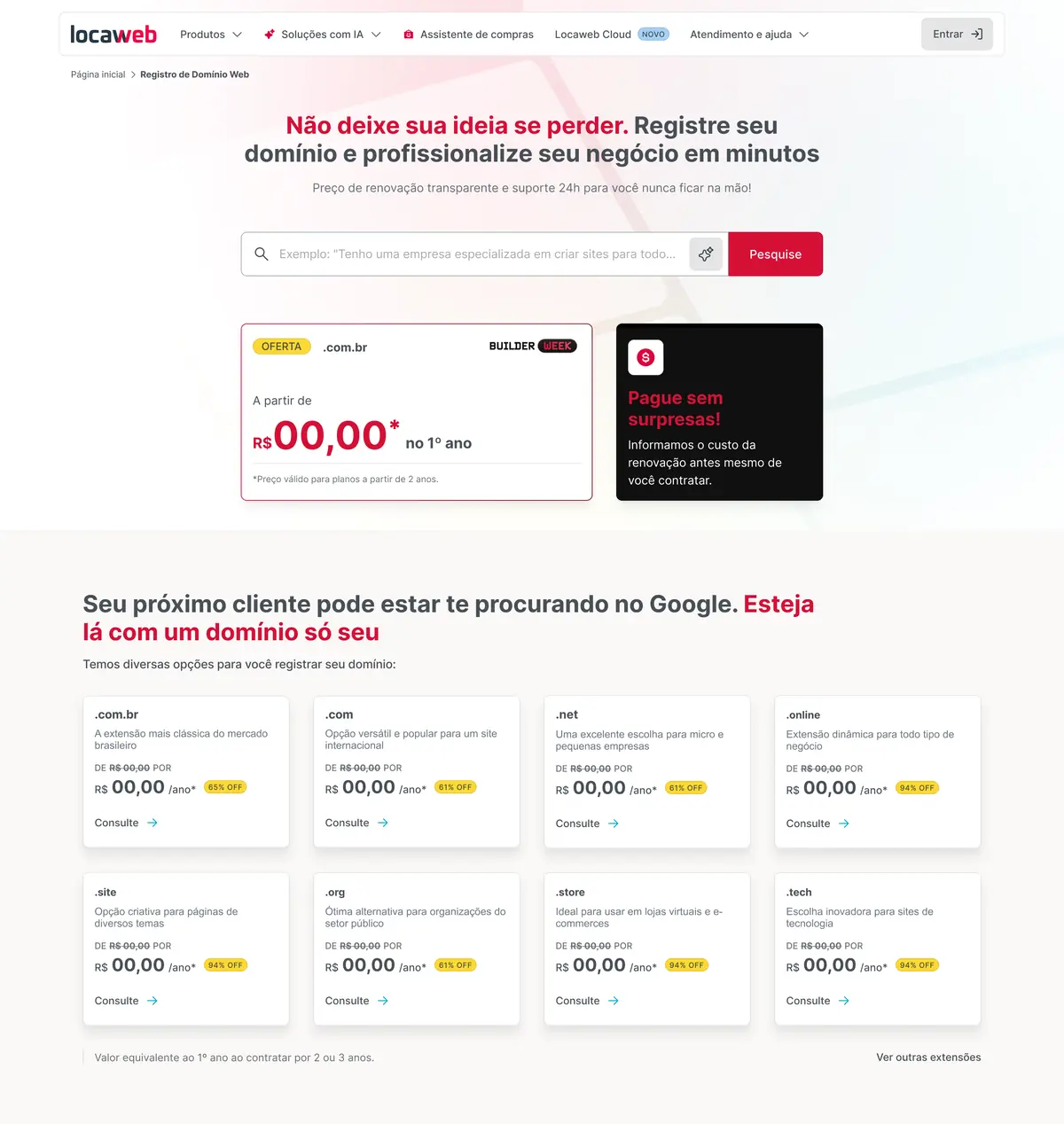
Turn the objection into an argument
The “Pay with no surprises” section states the renewal cost before purchase.
Guide people who don’t have a name yet
The search gained an AI mode. Instead of arriving with a ready-made name, people describe their business. I wrote the copy for the feature, and the placeholder teaches this use with a natural-language example: “I have a company that specializes in building websites…”.
I also worked with the Product Designers on how to trigger the feature. In the first version, the search had two tabs, one to register a domain and another to generate AI suggestions: anyone who wanted the AI had to switch modes before typing. We replaced the tabs with a sparkle icon inside the field itself, and the experience became smoother.
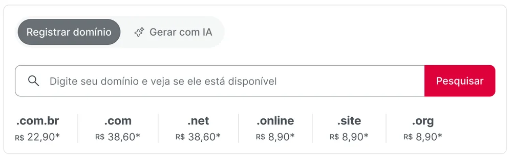

Help people choose the extension
Each extension got a line saying who it’s for, such as “.store: ideal for online stores and e-commerce sites”.
Error messages
From system error to user guidance
Old pattern
- Blames the user
- Uses technical jargon
- Creates a dead end
New pattern
- Explains the rule in plain language
- Anticipates the next question
- Offers an immediate fix
Anatomy of the new message
- 1A clear rule. The system limit, with no jargon or error codes.
- 2Guidance. A tip that helps people get it right on the next try.
- 3An invitation to continue. A light call to action that takes the weight off the error.
The first batch of scenarios
| Scenario | New message (translated) |
|---|---|
| Empty field | You haven’t typed a domain yet. Shall we try again? |
| Invalid characters | Invalid characters. Remember not to use spaces, accents or symbols (like @, &, !). Shall we try again? |
| More than 63 characters | Your domain can have up to 63 characters. Tip: short names are easier to remember. Try again! |
| Nonexistent extension | We couldn’t find this extension. You can use popular options (.com and .com.br) or check our list. Try again! |
Results
and about 5% more time on page after the first batch of messages.
Domain search is one of the highest-traffic pages and the gateway to the other products. The gain came from copy changes alone, with no layout changes. A second batch of messages had already been mapped in a prioritization matrix, and the approach was set to become the model for the other error pages on the site.
Approximate figures, measured after launch.
Learnings
Error messages are also about conversion: it’s the moment when users most need direction. In low-cost, high-distrust purchases, transparency works as a sales argument.